Media
Surfaces for pictures and sound — viewers, galleries, carousels, video and audio players, plus the thumbnails, placeholders and upload previews that surround them. Frames reserve their aspect ratio before anything loads, viewer chrome stays dark in both themes, and every control bar shares one glass gradient treatment.
Image Viewer
A dark stage that centers one image, with a
.b-image-viewer__bar pinned to the bottom edge for the
caption and actions. The stage stays near-black in both themes so
photos read the same everywhere. Demos on this page use gradient
placeholders in place of real files.
alt text — the caption bar is extra context, not a
substitute for it. Purely decorative imagery gets
alt="" so screen readers skip it. Keep captions as real
text in the bar, never baked into the pixels, so they scale, wrap
and translate.Image Gallery
An auto-filling square grid. Wrap each tile in a
<button> (or <a>) — the grid
strips the chrome, rounds the corners and adds a
zoom-in cursor, and real images get a gentle hover
scale.
Carousel
A scroll-snap track — it works with plain CSS, and adding
data-b-carousel lets barua.js wire the
prev/next buttons to smooth scrolling and keep the dots in sync.
Slides default to 70% of the track width; override with
--b-slide-w.
Billboard
The featured title on a media storefront: art behind, words in
front. The scrim fades the picture into the page colour from below
and from the start edge, so the text never fights it and the shelf
underneath feels attached. Put .b-container on the
body for the gutters. The block is tall on a phone —
min(62svh, 34rem) — and capped on a desktop so the
shelves stay above the fold; --b-billboard-h sets the
height and --b-billboard-focus moves the picture's
subject into view.

Poster
A title as a 2:3 picture with its name under it — the unit of a
catalogue. The whole block is one link. The frame holds its shape
before the picture arrives, so a slow connection never makes the
shelf jump, and a title with no picture shows its initial on a
plate tinted from the accent. A .b-badge in
.b-poster__badge sits on the picture for a price or a
state. .b-poster--wide is the 16:9 form for an
episode; .is-selected marks the one playing.
Put posters in .b-poster-grid for a wall — as many
across as fit, three on a phone — with --b-poster-min
as the one knob.




Shelf
Posters on a carousel make a shelf.
.b-carousel--posters narrows each slide to a poster and
lets it lift on hover; the prev and next buttons scroll a screenful
at a time, and step aside on a touch screen, where a shelf scrolls
by thumb. A shelf holds a dozen titles — for a whole catalogue, use
the grid.

Video Player
A 16:9 frame around a <video> element. The
.b-video__overlay with its glass
.b-video__play button fades in on hover, or stays
visible while the frame carries .is-paused. The bottom
bar is the shared Media Controls
strip.
aspect-ratio: 16 / 9 holds the layout before a single
byte of media arrives, so the page never jumps when the poster or
stream loads.prefers-reduced-motion is set.Audio Player
A compact row: .b-audio__art, a flexible
.b-audio__meta block with title, artist and a
.b-progress track, and transport buttons in
.b-audio__controls.
Glass + waveform
.b-audio--glass swaps the surface for translucent
material — for players floating over artwork. The decorative
.b-waveform draws one <i> bar per
sample, height set via --v, with played bars marked
.is-played.
Media Controls
The shared bottom bar used by the video player and any custom
media frame. It pins to the bottom of the nearest
position: relative ancestor over a soft black
gradient, forces dark color-scheme, and makes any inner
.b-icon-btn white and transparent. The
.b-slider (a native range input from
Forms) flexes to fill the row, and
.b-media-controls__time keeps timestamps in tabular
numerals so they never wiggle.
<button> with an aria-label — never
a clickable div. The seek bar is a native
<input type="range">, so arrow keys scrub and
the value is announced; keep Space toggling play. Honour
prefers-reduced-motion: no autoplay, no auto-advancing
carousels for those users.Thumbnail
A square media chip, sized with --b-thumb-size
(default 4.5rem). .b-thumb--video overlays a play
glyph, and .b-thumb__duration stamps a runtime in the
corner.
Media Placeholder
The empty state for a media slot — a dashed 16:9 frame with a hatched fill and a quiet glyph. Use it wherever an image or video hasn't been chosen, uploaded or loaded yet; it holds the exact space the media will occupy.
Upload Preview
A grid of square tiles for files being attached. While a file
uploads, float a .b-progress near the bottom edge;
once done, show the .b-upload-preview__remove button.
Pairs with the File Upload dropzone in
Forms.
Async Image
SwiftUI's AsyncImage loading choreography: wrap the
image in .b-async-img and add data-b-async
— it shimmers while loading, then the picture fades in. Errors stop
the shimmer and leave the quiet fill.
'/%3E%3C/svg%3E)
Blur-up
A shimmer says something is coming. A blurred copy of the picture says
what is coming — the layout is right, the colours are right,
and the photograph resolves rather than appears. Give
--b-img-placeholder a thumbnail as a data URI and mark
the host data-placeholder; that also tells the shimmer to
stand down. The one below is 1073 bytes.
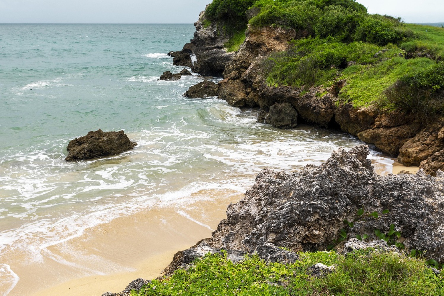
Left: waiting, showing the placeholder. Right: the real picture, faded
in over it. In React this is <AsyncImage placeholder=… />.